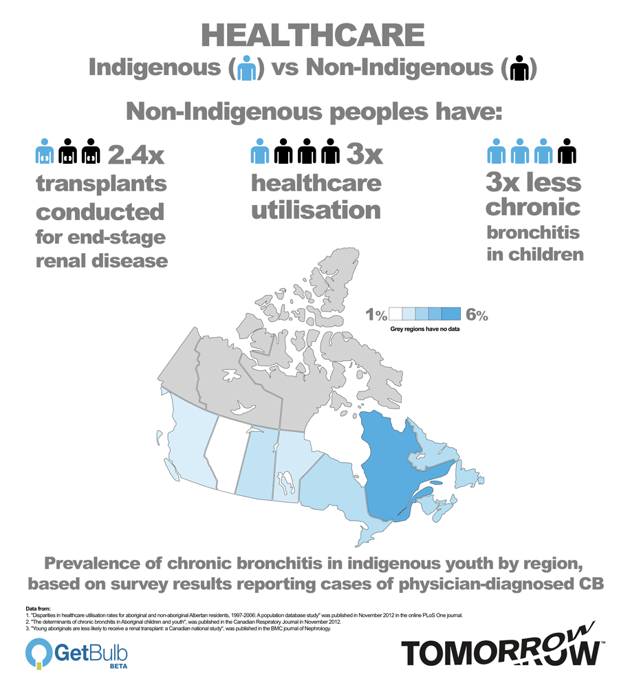
 Tomorrow recently ran its first data journalism graphic as part of our reporting on the health inequity between indigenous and non-indigenous peoples.
We worked with the winner of the 2012 Irish Times Digital Challenge, GetBulb, to take complex medical research data and present a graphic representation of the disparity and inequality found by studies in our feature. The image had our second highest “views” on Facebook in a year and the feature had the third highest number of hits according to Google Analytics.
There were multiple versions of the infographic created, each getting different reactions from those who saw them, hinting at the challenges of creating a single image that can be easily understood in the same way by anyone.
Reporters have to ask the questions to understand the story and reduce it to information that readers can then use to build their own understanding. A graphic is like the base of a valley. The data is the central stream where both reporter and reader meet, but both come from different sides of the valley and have different perspectives from those heights of knowledge and experience. The data remains the same but it doesn’t mean the interpretation will be.
Data journalism is an important part of what news organisations do. From the graphs showing stock market trends to pie charts of government spending, infographics have been part of reporting for a while.
For Tomorrow, infographics are part of what we need to meet our core principles, including on accuracy, openness and education – any medium and technology that can help us is to be welcomed.
We look forward to developing further images and graphics with GetBulb.
What did you think of the first graphic? What story should we consider that might involve some data journalism? Please get in touch.